ROBERT MOTHERWELL "SUMMERTIME IN ITALY" 1966
Robert Motherwell (1915-1991), alongside Jackson Pollock, Mark Rothko, and Willem de Kooning, made up the quartet of American abstract painters that radically defined abstraction and established New York City as the center of the art world for the second half of the 20th century.
Motherwell was also the unofficial spokesman of the New York School, writing, teaching, and lecturing on behalf of the movement, his fellow artists, and the merits of abstraction.
His work appears in museum collections around the world and is instantly recognizable for its boldness and black forms. Yet in addition to his impressive paintings, Motherwell is also revered as a printmaker. He is one of the most innovative and prolific printmakers of the 20th century. He was always searching for new techniques, whether at his own printmaking atelier or collaborating with others, to expand his ideas and express his aesthetic.
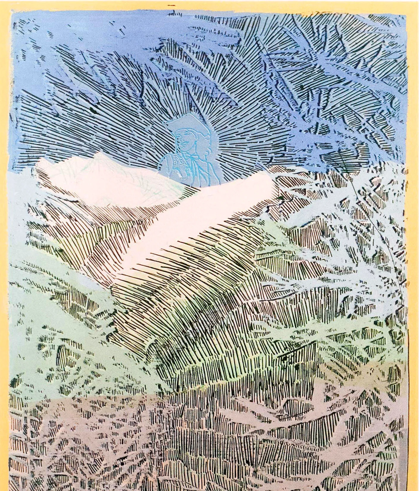
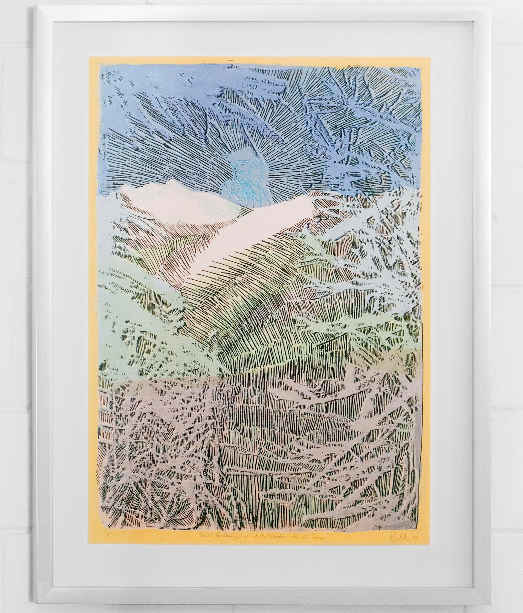
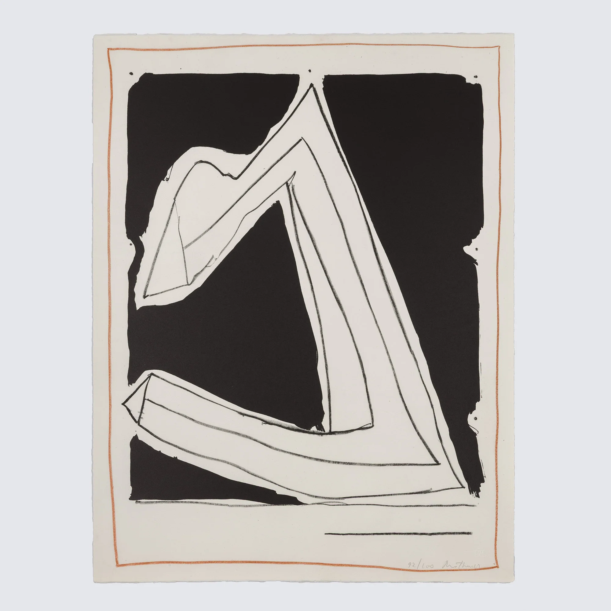
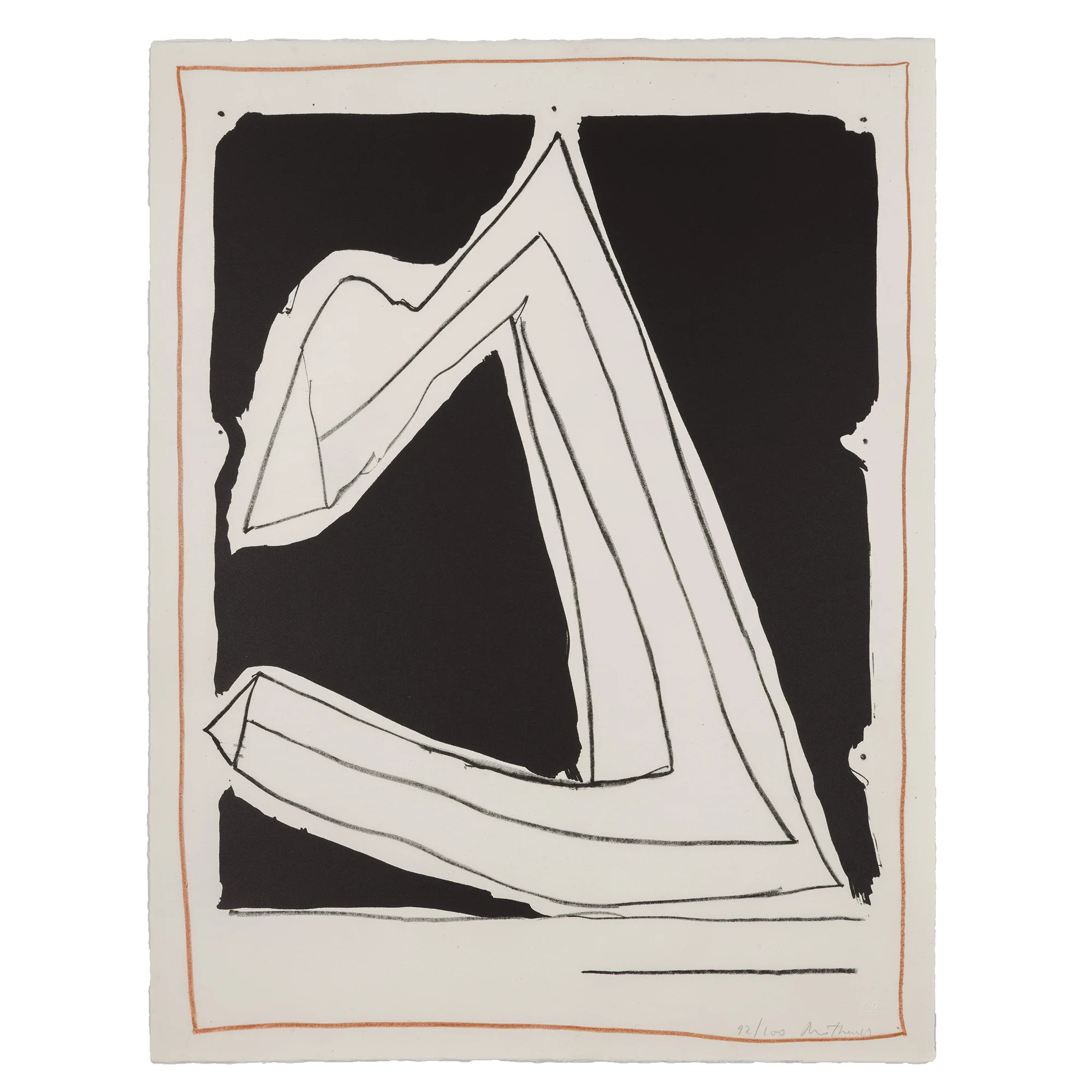
In the 1960s, Motherwell visited Italy on vacation with his then-wife, Helen Frankenthaler. Motherwell became enamored with the Italianate landscape and the mountainous terrain of the Liguria region, which inspired a series of paintings, "Summertime in Italy".
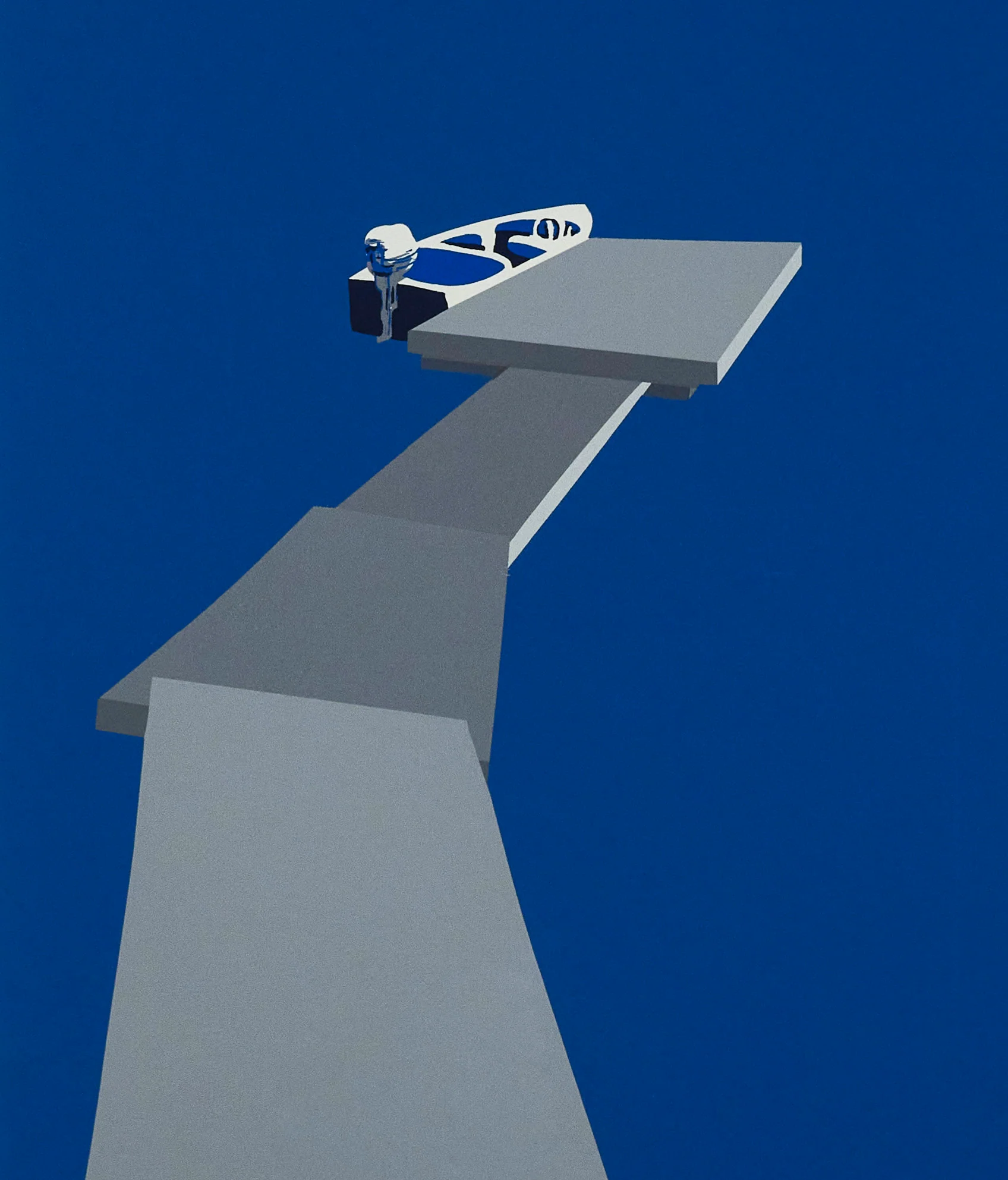
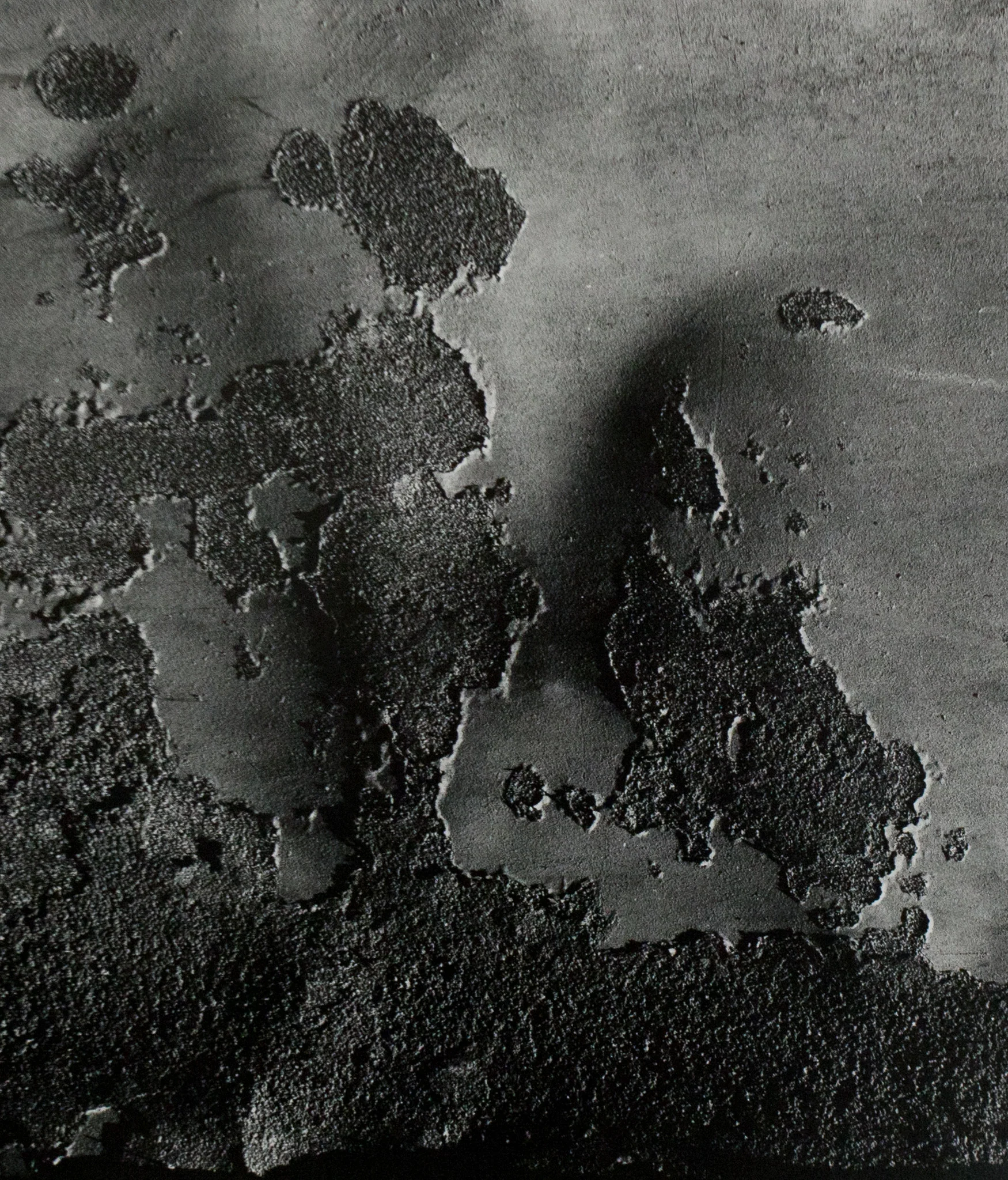
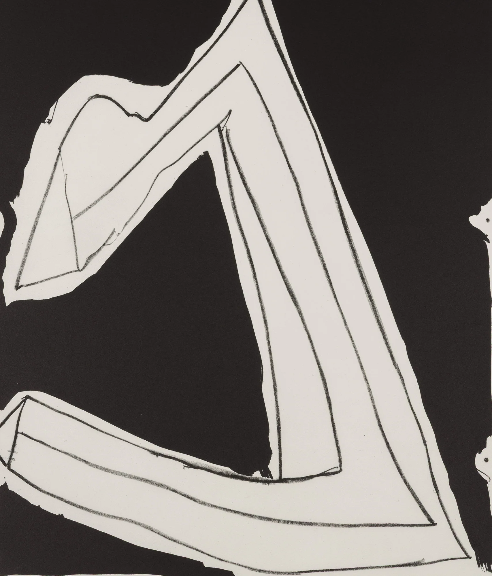
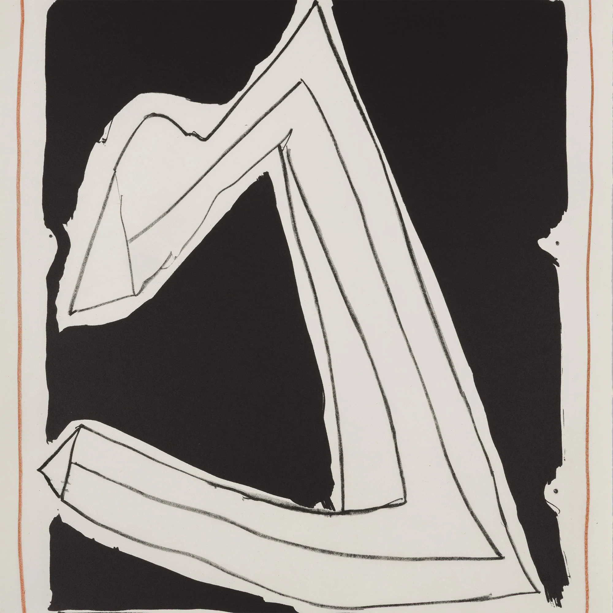
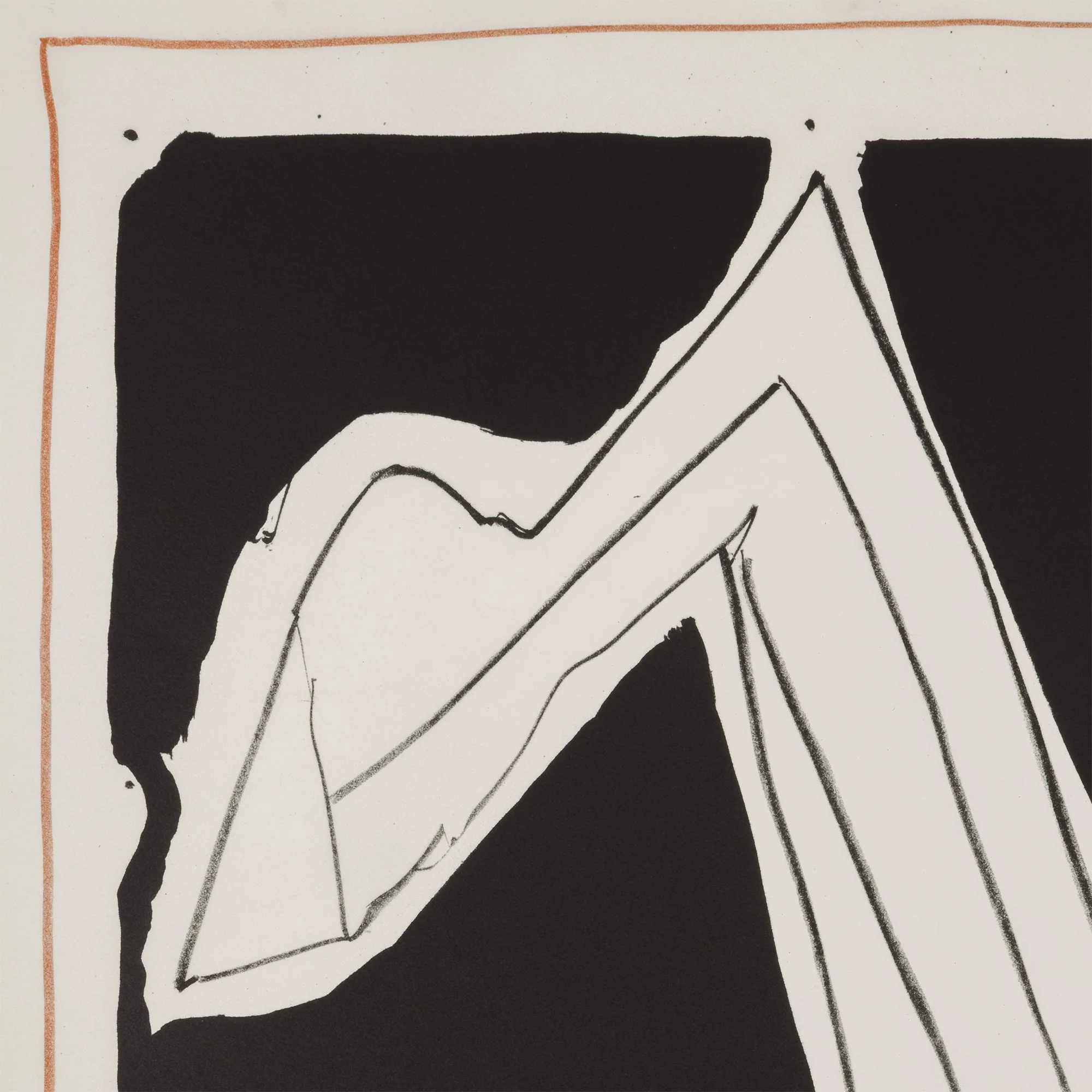
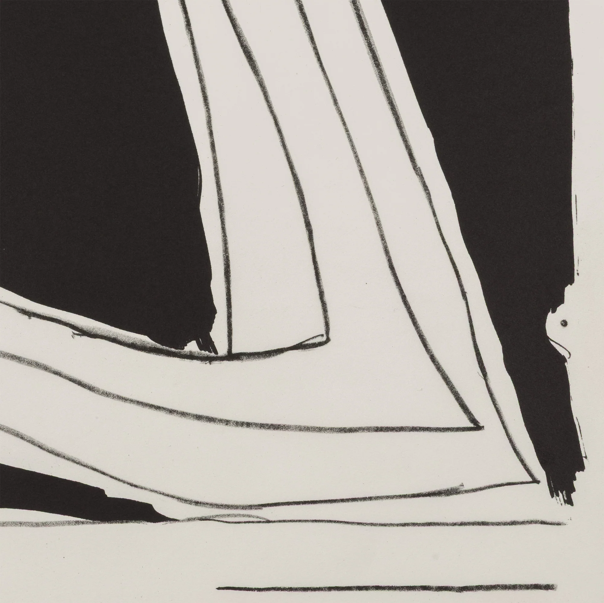
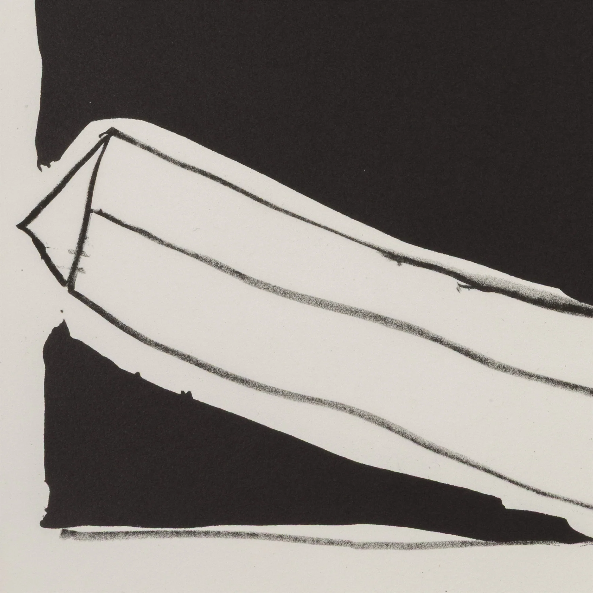
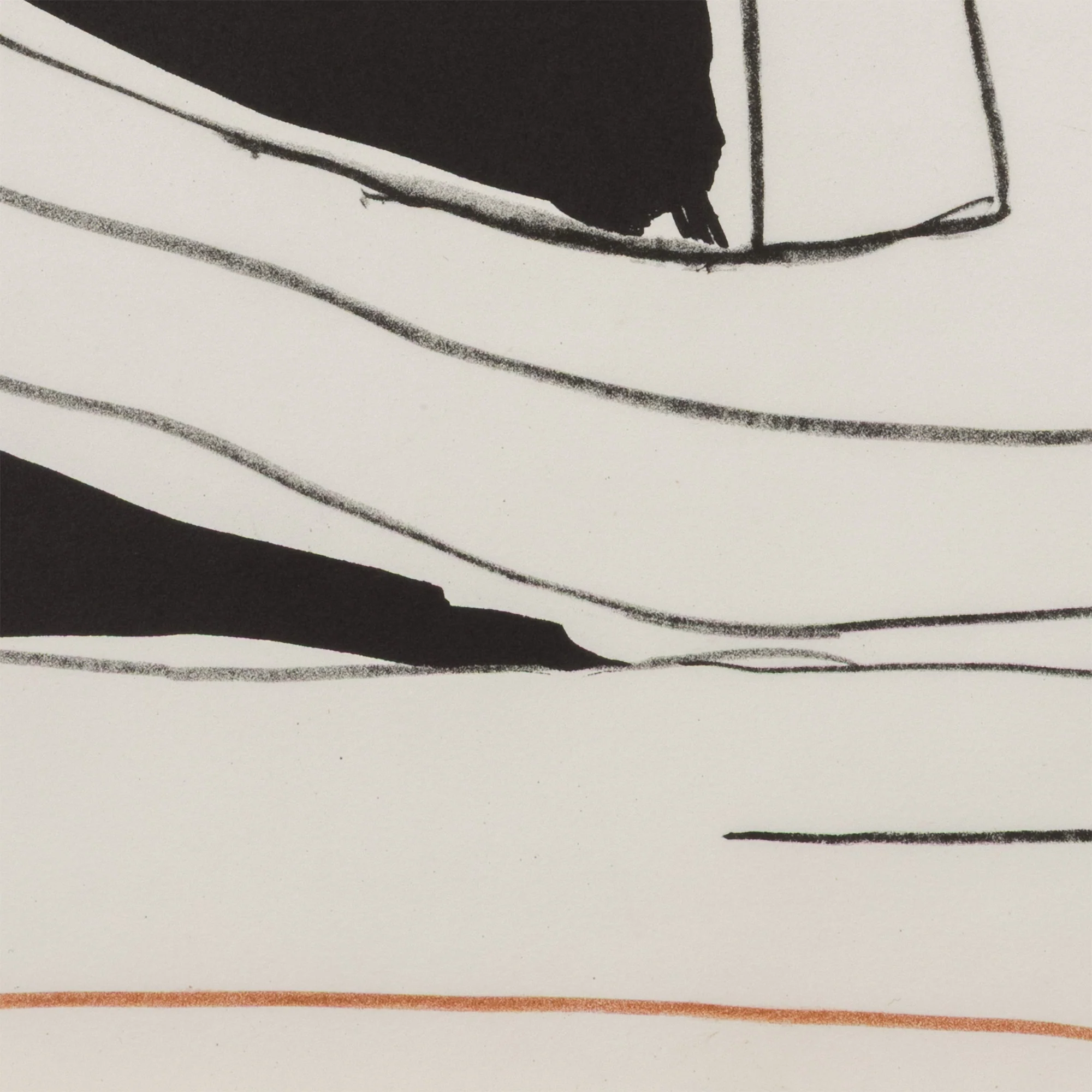
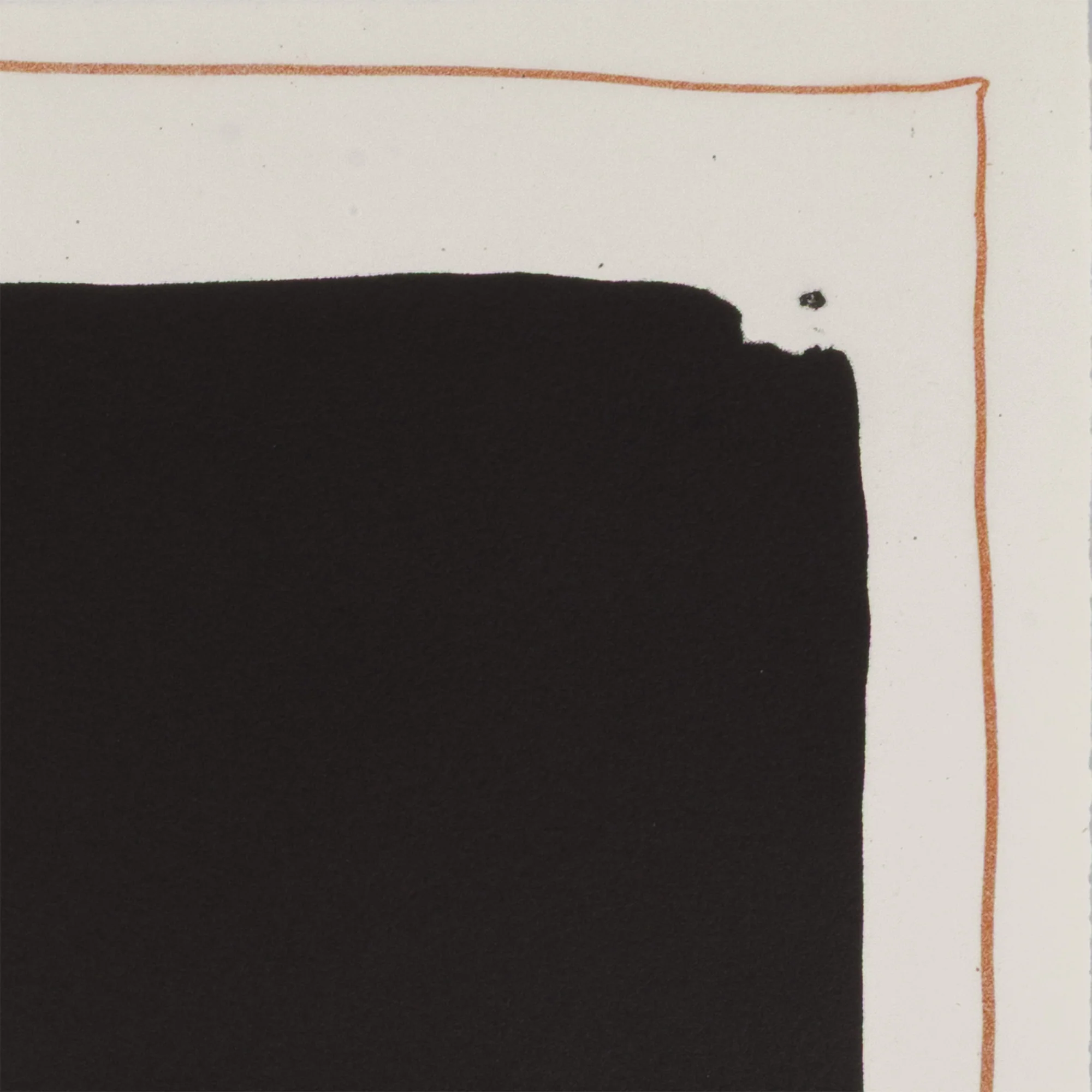
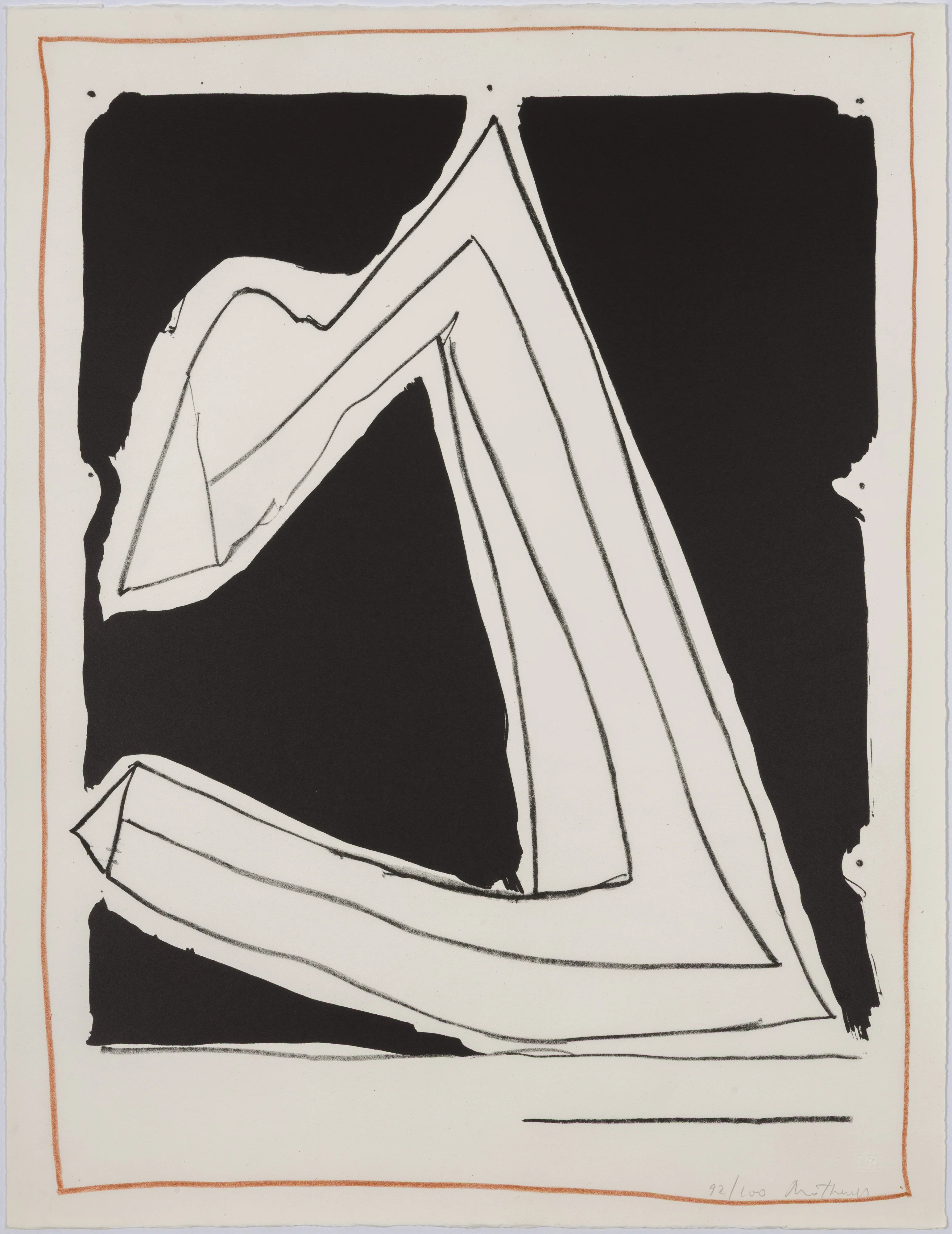
With the same title, this bold graphic lithograph which is related to the series, carries the same commanding presence. For this piece, Motherwell applied liquid tusche, a lightweight ink that would enable rapid application comparable to his "Spontaneity Paintings".
The strong, frenetic strokes result in a vigorous composition that in true Motherwell fashion is highly intuitive while also demonstrating great restraint. This enigmatic shape, that we could describe as a rebellious or contorting triangle, makes many appearances in Motherwell's work. How do you interpret this form?
Questions about this piece? Contact us, call +1.416.704.1720, or Visit our Toronto gallery.
"Summertime in Italy (with Lines)"
USA, 1966
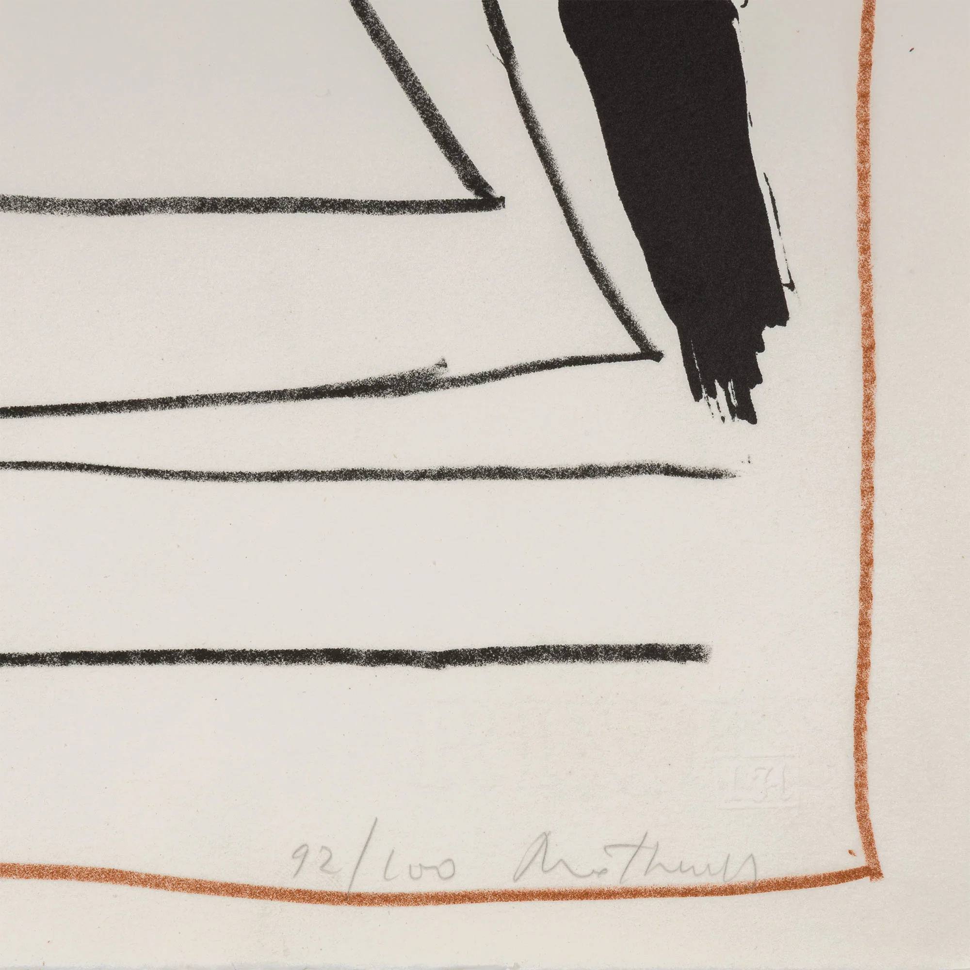
Lithograph on rives BFK paper
Signed and numbered "92/100" in pencil lower right; printer's chop mark lower right
From an edition of 100
22.25"H 17"W (work)
Publisher: Hollander Workshop, New York
Printer: Irwin Hollander, Hollaner Workshop, New York
Very good condition
Provenance: Kasmin (NYC) / The Dedalus Foundation
Catalogue Raisonné: CR 35 in Prints & Editioned Works from Dedalus Foundation
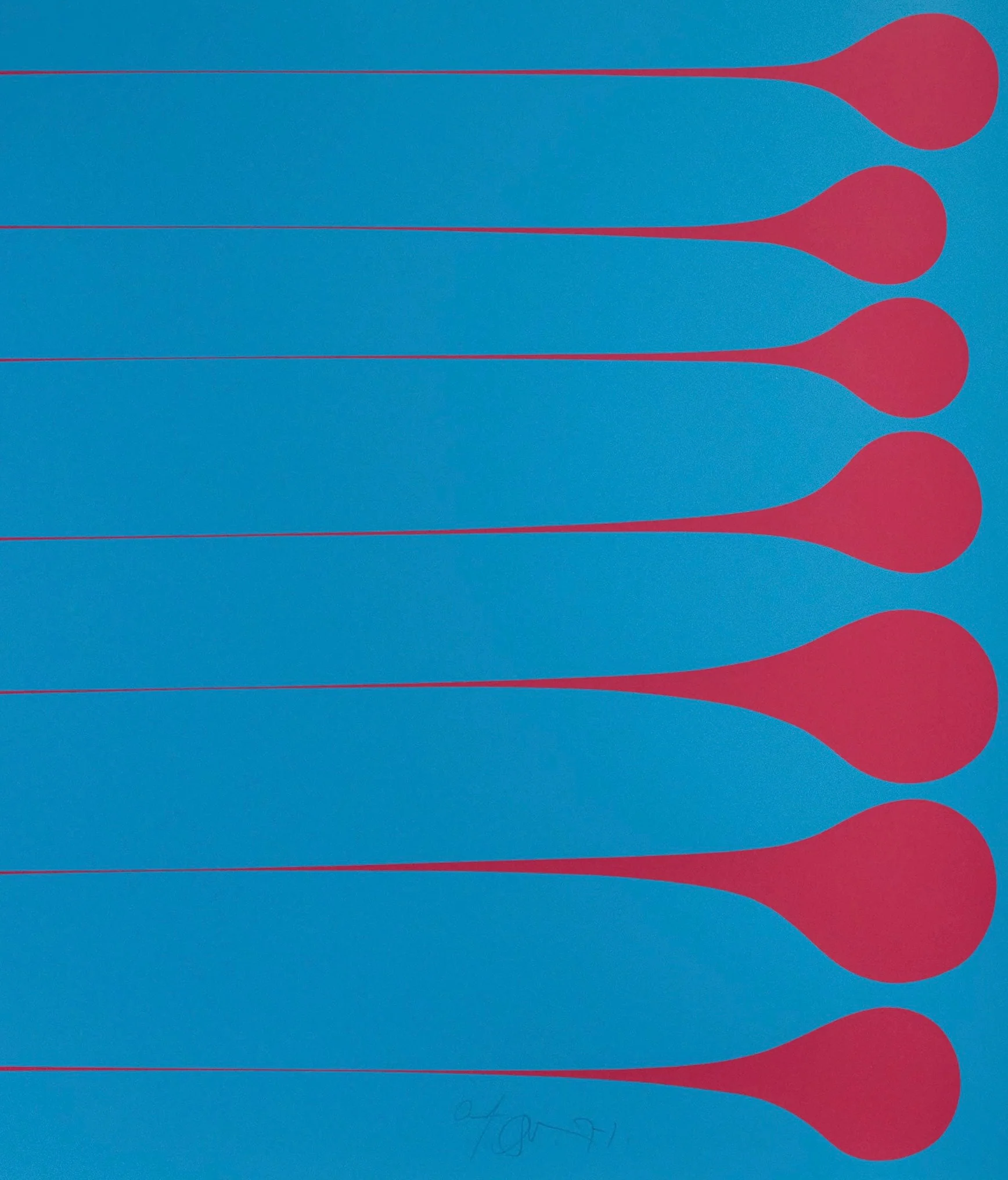
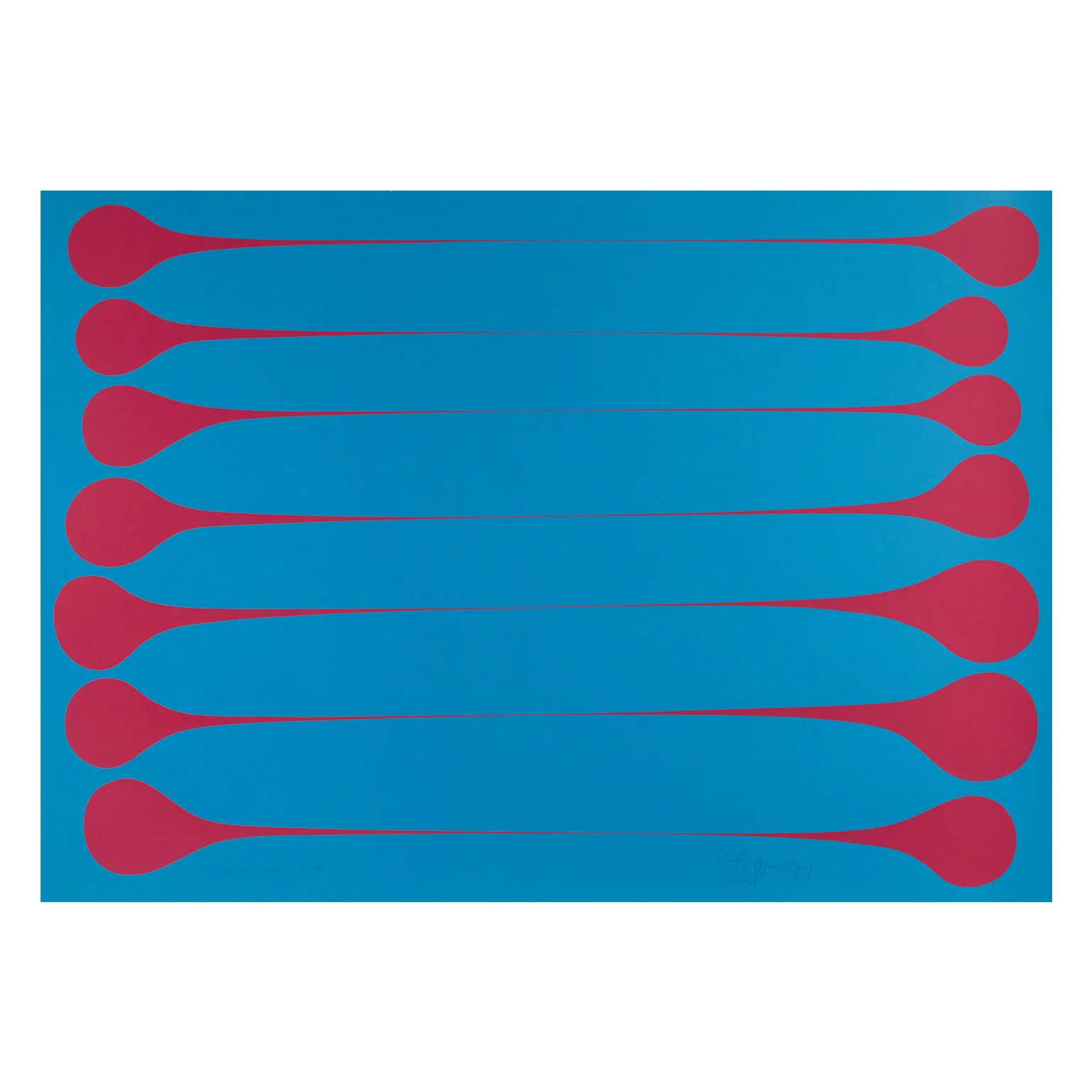
Note: The edition of 100 was divided into three groupings printed with different background colors; light blue for the first third, dark blue for the second third, and black for the last third, although no documentation of the exact numbering sequences exists in archival or workshop records.
More Images
ROBERT MOTHERWELL "SUMMERTIME IN ITALY" 1966
Robert Motherwell (1915-1991), alongside Jackson Pollock, Mark Rothko, and Willem de Kooning, made up the quartet of American abstract painters that radically defined abstraction and established New York City as the center of the art world for the second half of the 20th century.
Motherwell was also the unofficial spokesman of the New York School, writing, teaching, and lecturing on behalf of the movement, his fellow artists, and the merits of abstraction.
His work appears in museum collections around the world and is instantly recognizable for its boldness and black forms. Yet in addition to his impressive paintings, Motherwell is also revered as a printmaker. He is one of the most innovative and prolific printmakers of the 20th century. He was always searching for new techniques, whether at his own printmaking atelier or collaborating with others, to expand his ideas and express his aesthetic.
In the 1960s, Motherwell visited Italy on vacation with his then-wife, Helen Frankenthaler. Motherwell became enamored with the Italianate landscape and the mountainous terrain of the Liguria region, which inspired a series of paintings, "Summertime in Italy".
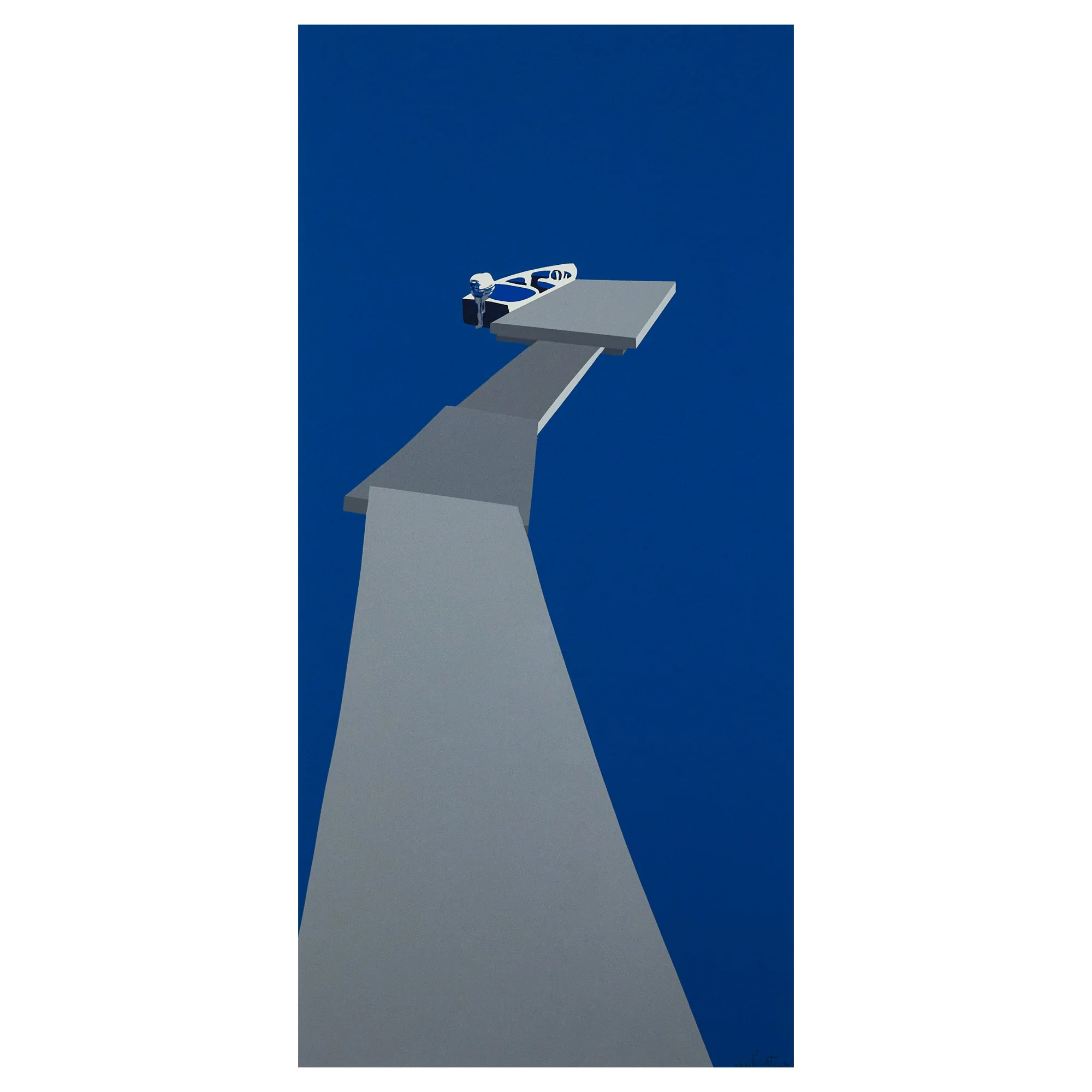
With the same title, this bold graphic lithograph which is related to the series, carries the same commanding presence. For this piece, Motherwell applied liquid tusche, a lightweight ink that would enable rapid application comparable to his "Spontaneity Paintings".
The strong, frenetic strokes result in a vigorous composition that in true Motherwell fashion is highly intuitive while also demonstrating great restraint. This enigmatic shape, that we could describe as a rebellious or contorting triangle, makes many appearances in Motherwell's work. How do you interpret this form?
Questions about this piece? Contact us, call +1.416.704.1720, or Visit our Toronto gallery.
"Summertime in Italy (with Lines)"
USA, 1966
Lithograph on rives BFK paper
Signed and numbered "92/100" in pencil lower right; printer's chop mark lower right
From an edition of 100
22.25"H 17"W (work)
Publisher: Hollander Workshop, New York
Printer: Irwin Hollander, Hollaner Workshop, New York
Very good condition
Provenance: Kasmin (NYC) / The Dedalus Foundation
Catalogue Raisonné: CR 35 in Prints & Editioned Works from Dedalus Foundation
Note: The edition of 100 was divided into three groupings printed with different background colors; light blue for the first third, dark blue for the second third, and black for the last third, although no documentation of the exact numbering sequences exists in archival or workshop records.
Product Information
Product Information
Shipping & Returns
Shipping & Returns
Description
Robert Motherwell (1915-1991), alongside Jackson Pollock, Mark Rothko, and Willem de Kooning, made up the quartet of American abstract painters that radically defined abstraction and established New York City as the center of the art world for the second half of the 20th century.
Motherwell was also the unofficial spokesman of the New York School, writing, teaching, and lecturing on behalf of the movement, his fellow artists, and the merits of abstraction.
His work appears in museum collections around the world and is instantly recognizable for its boldness and black forms. Yet in addition to his impressive paintings, Motherwell is also revered as a printmaker. He is one of the most innovative and prolific printmakers of the 20th century. He was always searching for new techniques, whether at his own printmaking atelier or collaborating with others, to expand his ideas and express his aesthetic.
In the 1960s, Motherwell visited Italy on vacation with his then-wife, Helen Frankenthaler. Motherwell became enamored with the Italianate landscape and the mountainous terrain of the Liguria region, which inspired a series of paintings, "Summertime in Italy".
With the same title, this bold graphic lithograph which is related to the series, carries the same commanding presence. For this piece, Motherwell applied liquid tusche, a lightweight ink that would enable rapid application comparable to his "Spontaneity Paintings".
The strong, frenetic strokes result in a vigorous composition that in true Motherwell fashion is highly intuitive while also demonstrating great restraint. This enigmatic shape, that we could describe as a rebellious or contorting triangle, makes many appearances in Motherwell's work. How do you interpret this form?
Questions about this piece? Contact us, call +1.416.704.1720, or Visit our Toronto gallery.
"Summertime in Italy (with Lines)"
USA, 1966
Lithograph on rives BFK paper
Signed and numbered "92/100" in pencil lower right; printer's chop mark lower right
From an edition of 100
22.25"H 17"W (work)
Publisher: Hollander Workshop, New York
Printer: Irwin Hollander, Hollaner Workshop, New York
Very good condition
Provenance: Kasmin (NYC) / The Dedalus Foundation
Catalogue Raisonné: CR 35 in Prints & Editioned Works from Dedalus Foundation
Note: The edition of 100 was divided into three groupings printed with different background colors; light blue for the first third, dark blue for the second third, and black for the last third, although no documentation of the exact numbering sequences exists in archival or workshop records.